Case Study
Discover the right corporate solutions for growing a business
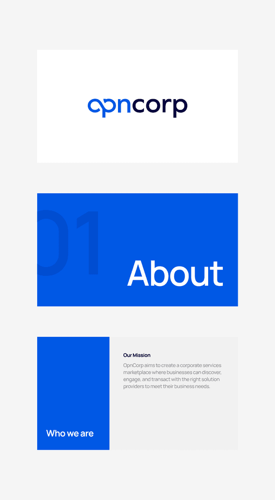
At VentureHaven, we designed OpnCorp, a B2B platform that allows companies to buy and sell business-related services in Asia.
Product
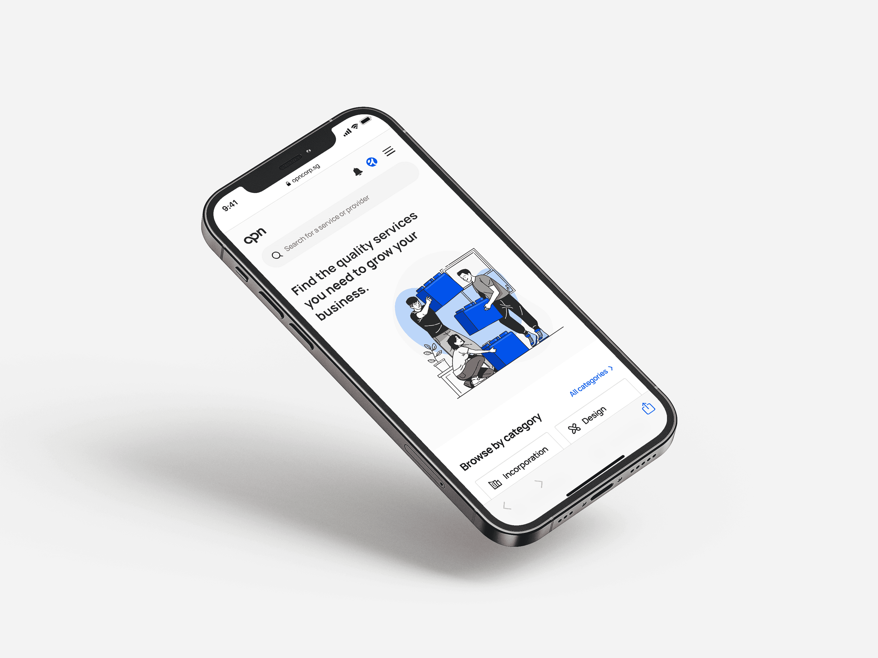
Website (Mobile)
Skills
UX/UI Design
Branding
My Role
Design Intern
Timeline
June 2023 - July 2023
Collaborators
Ivan Sim (Head of Product), Bin Nguyen (Product Designer), Chist Vu (Product Designer), Emily (UX Writer)
Overview
A strong and cohesive brand identity
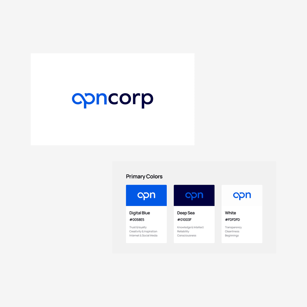
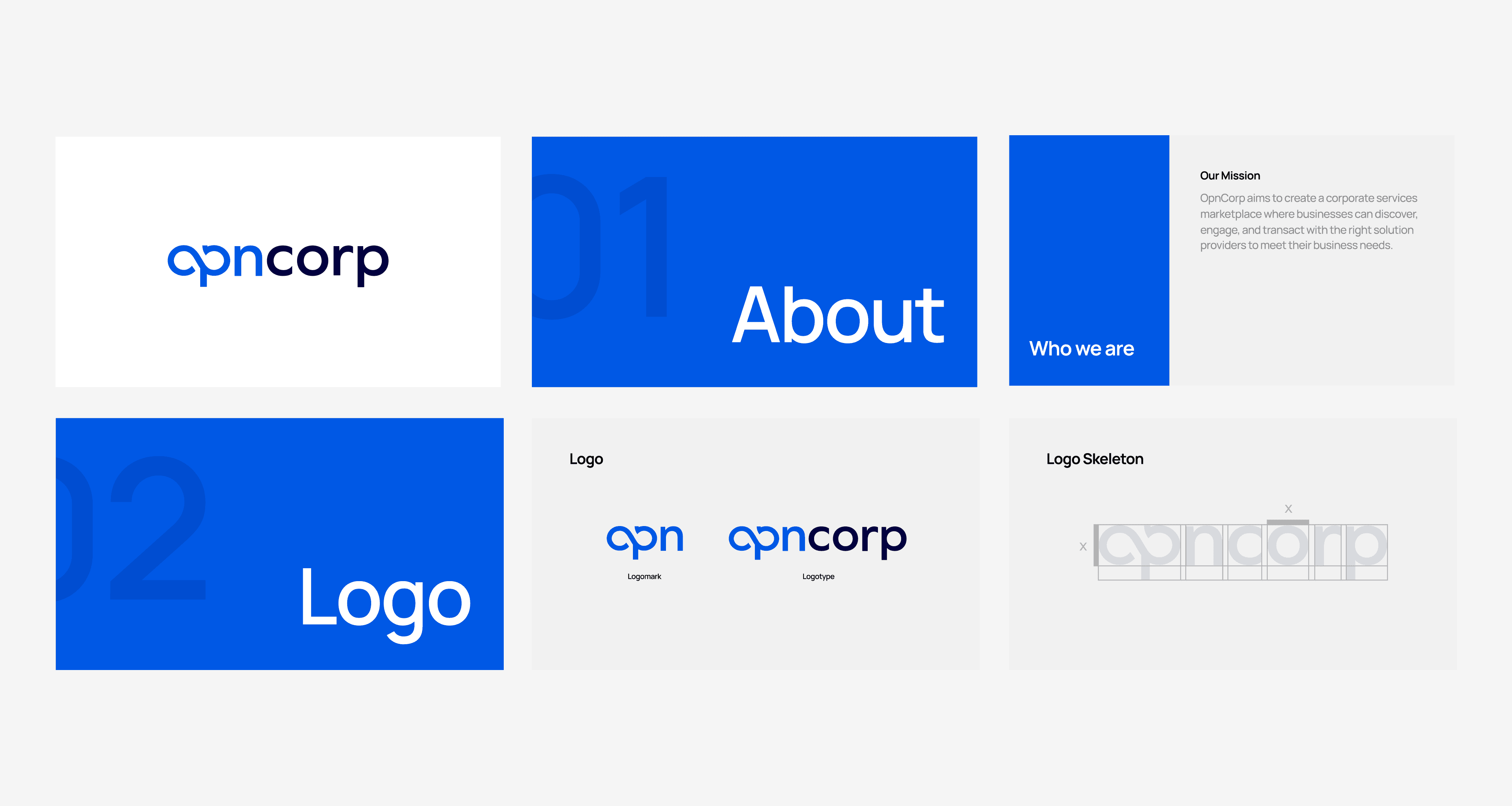
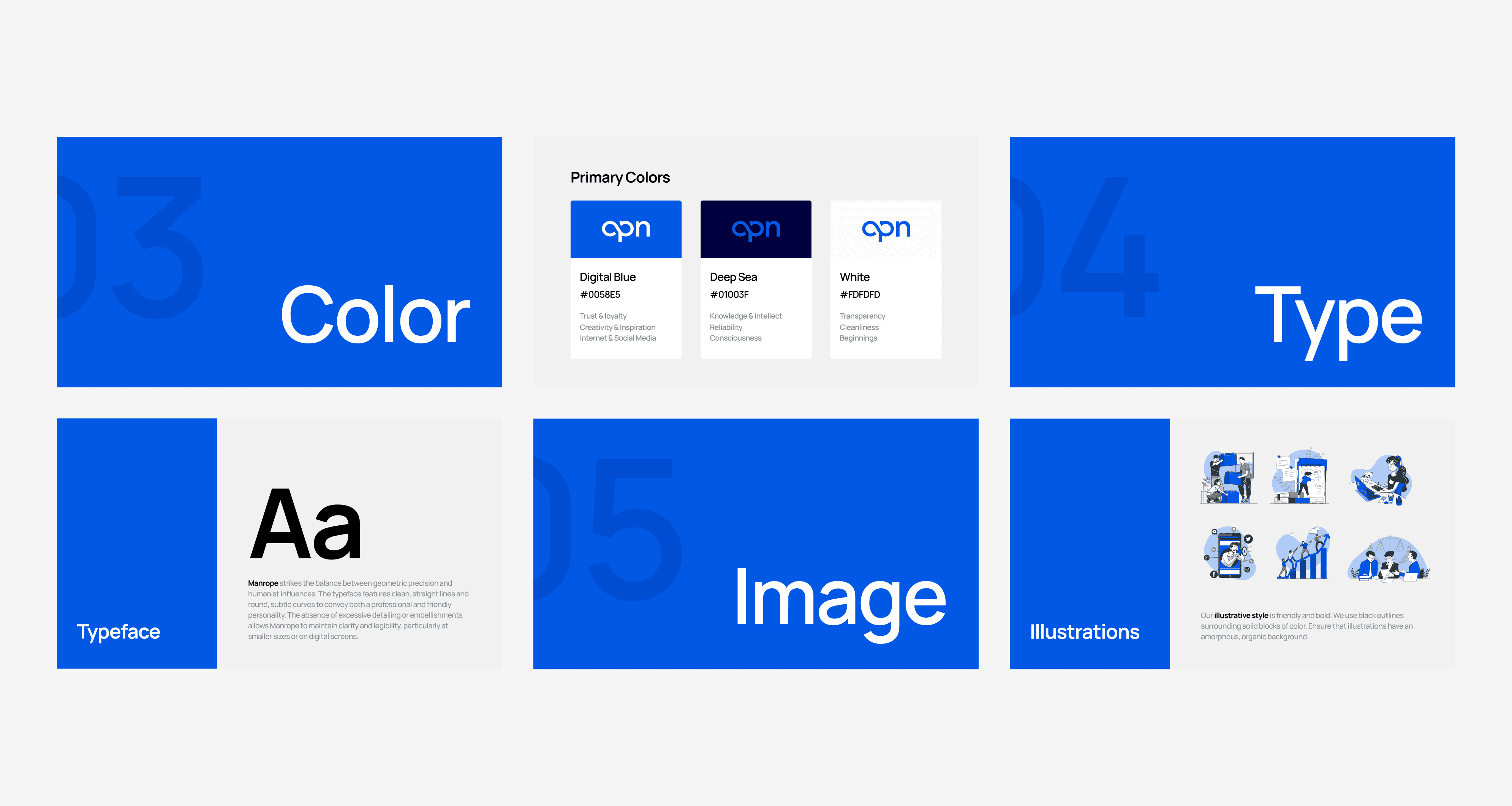
I cultivated a new look and feel for OpnCorp's visual identity to capture the essence of the brand's purpose, values, and mission. I created 40 pages of a brand style guideline that outlines the design and usage of OpnCorp's logo, typography, color, and visual assets.
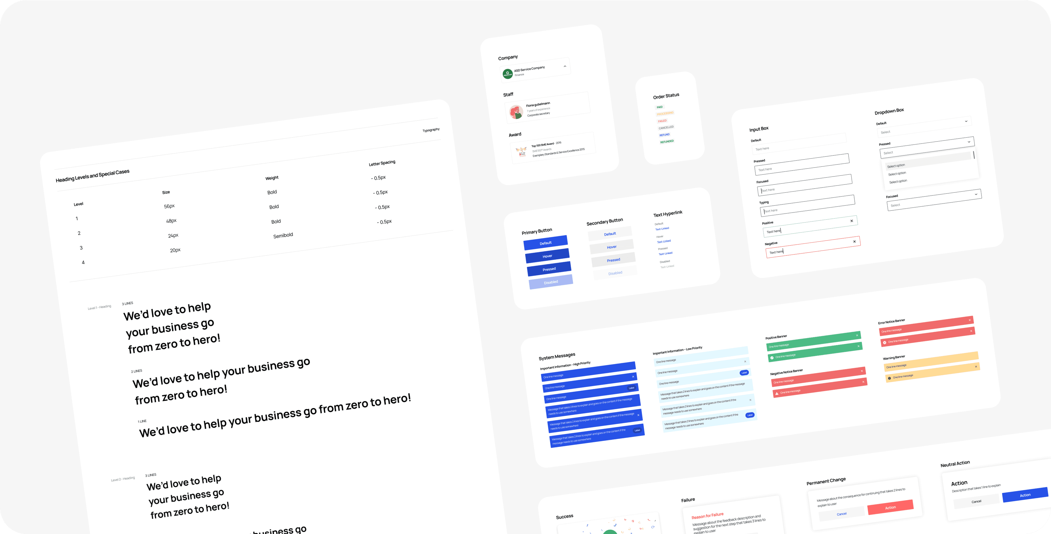
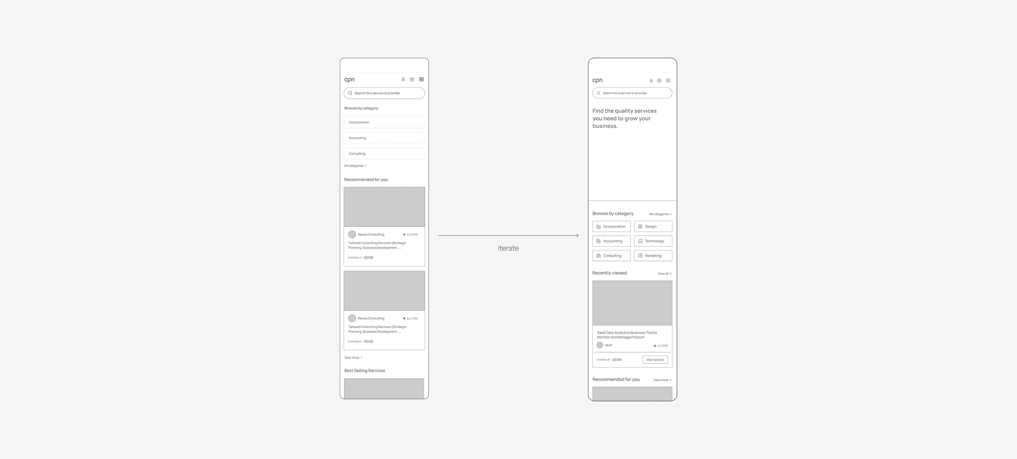
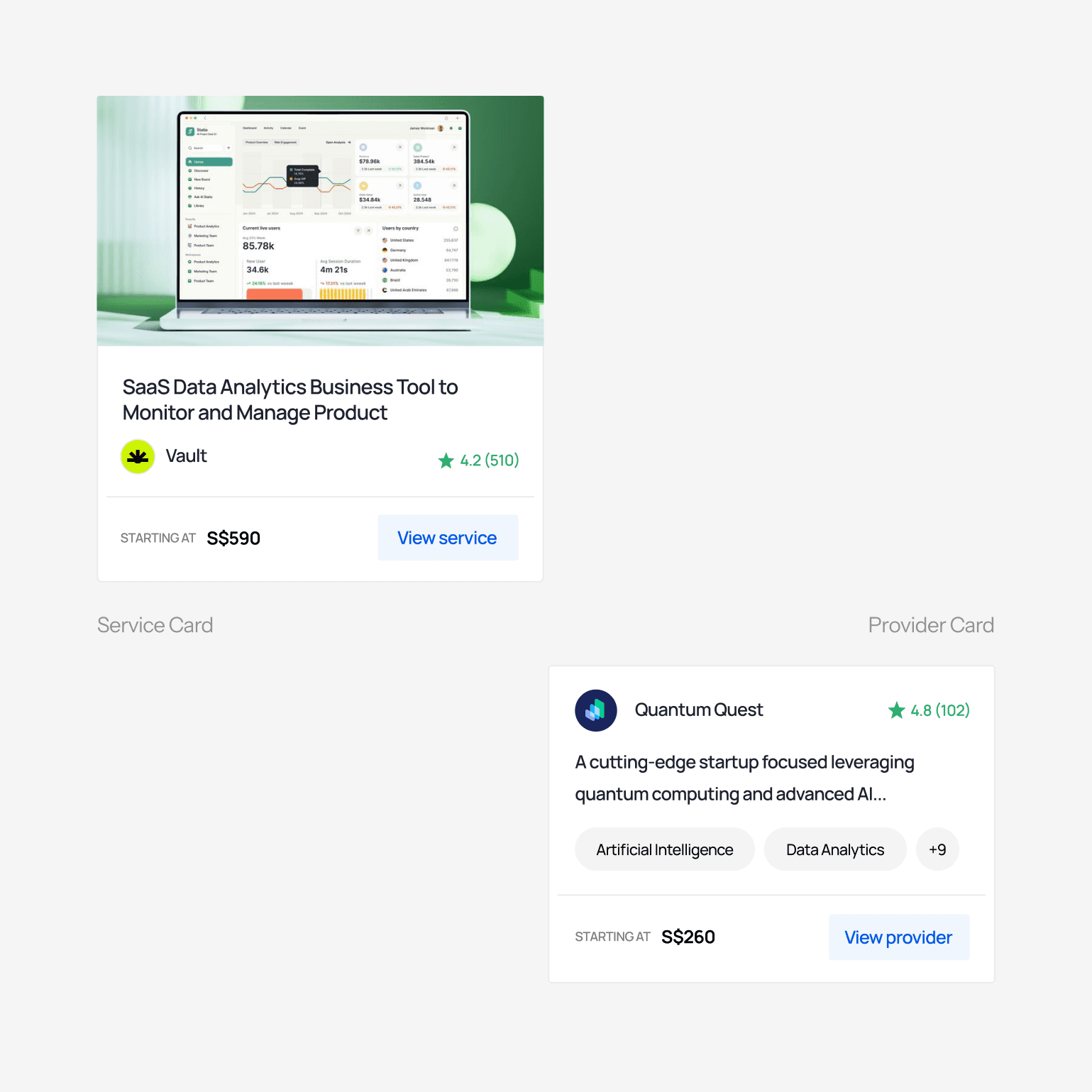
A robust UI design library
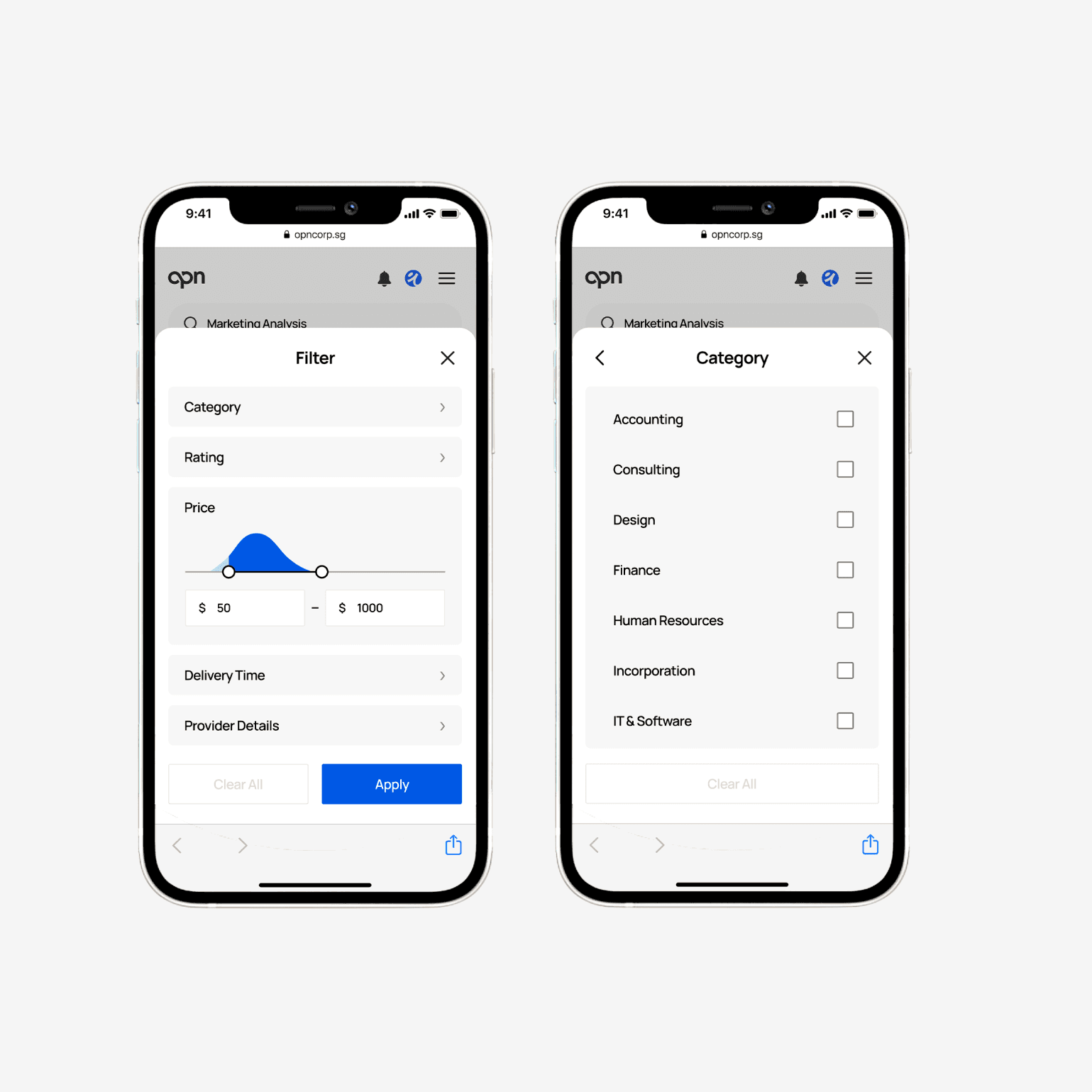
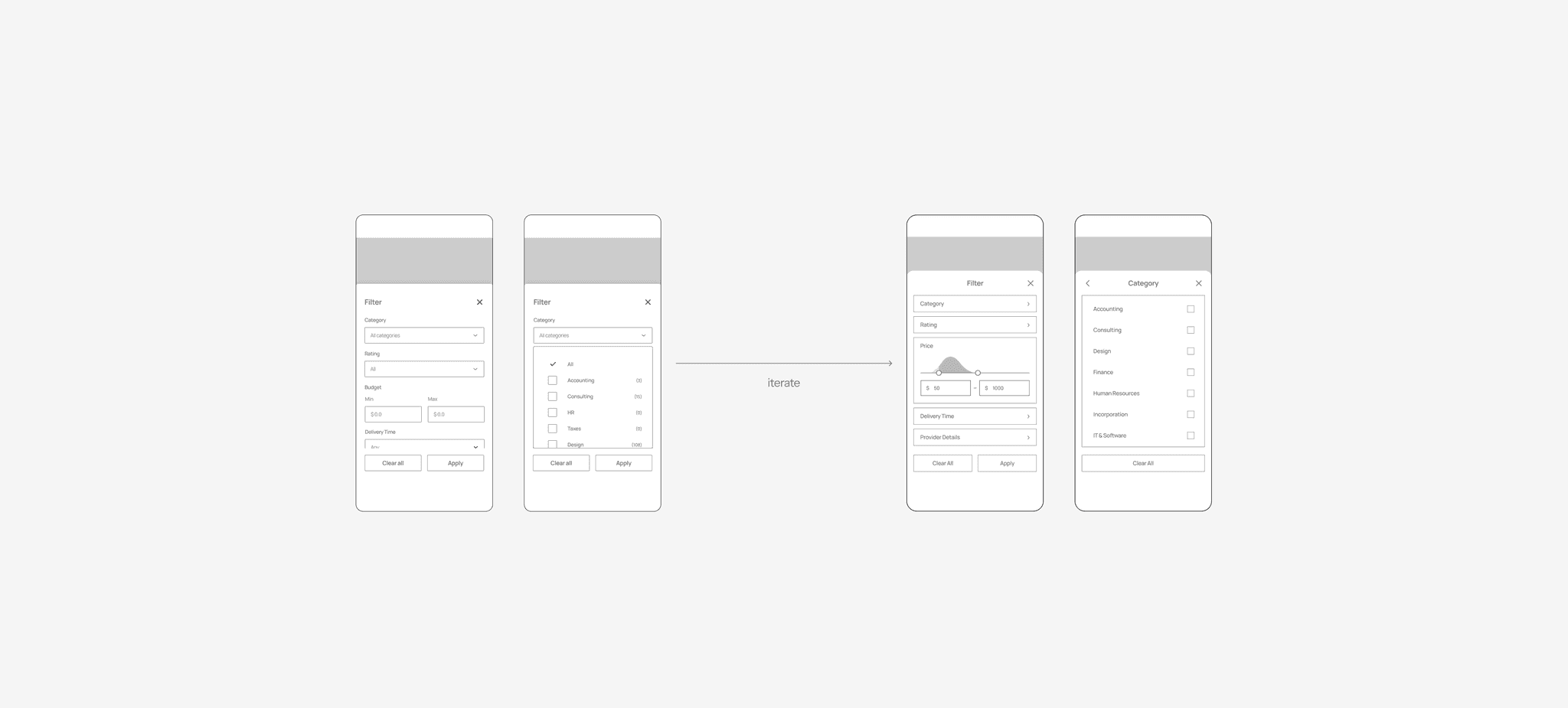
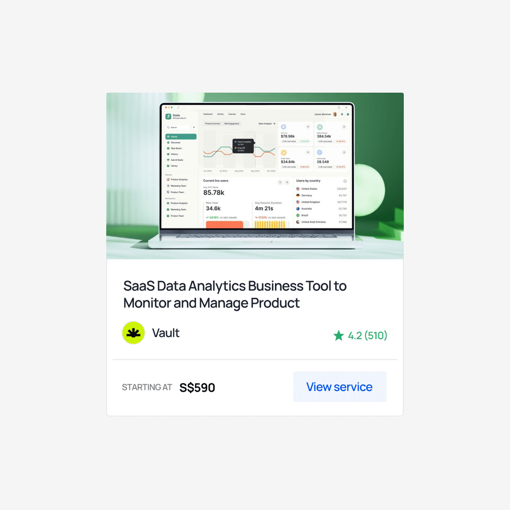
I helped the product designers develop a style guide to ensure consistency across all the pages. Using the style guide and atomic design methodology, we created and organized over 100+ atoms, molecules, and organisms.
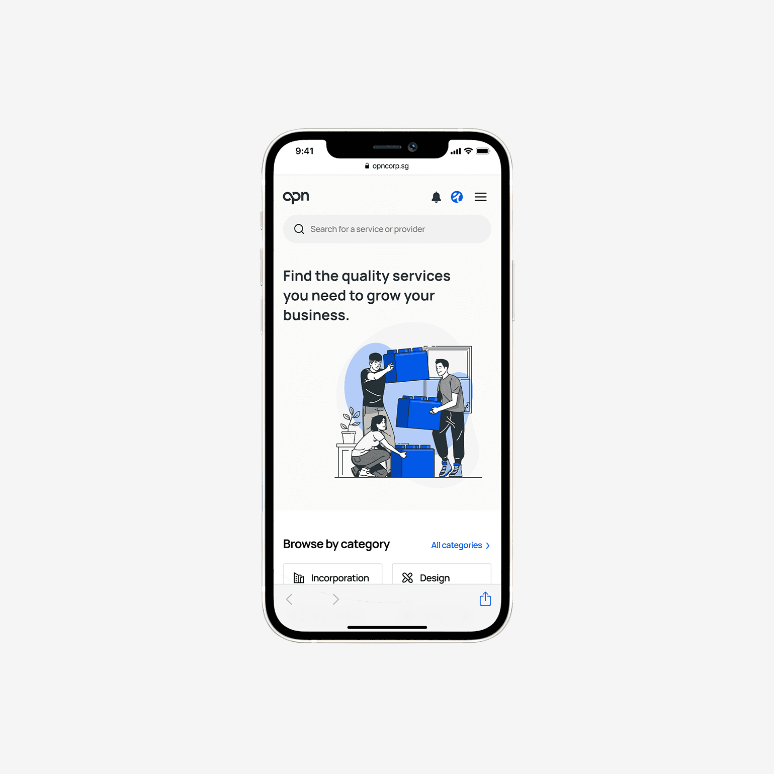
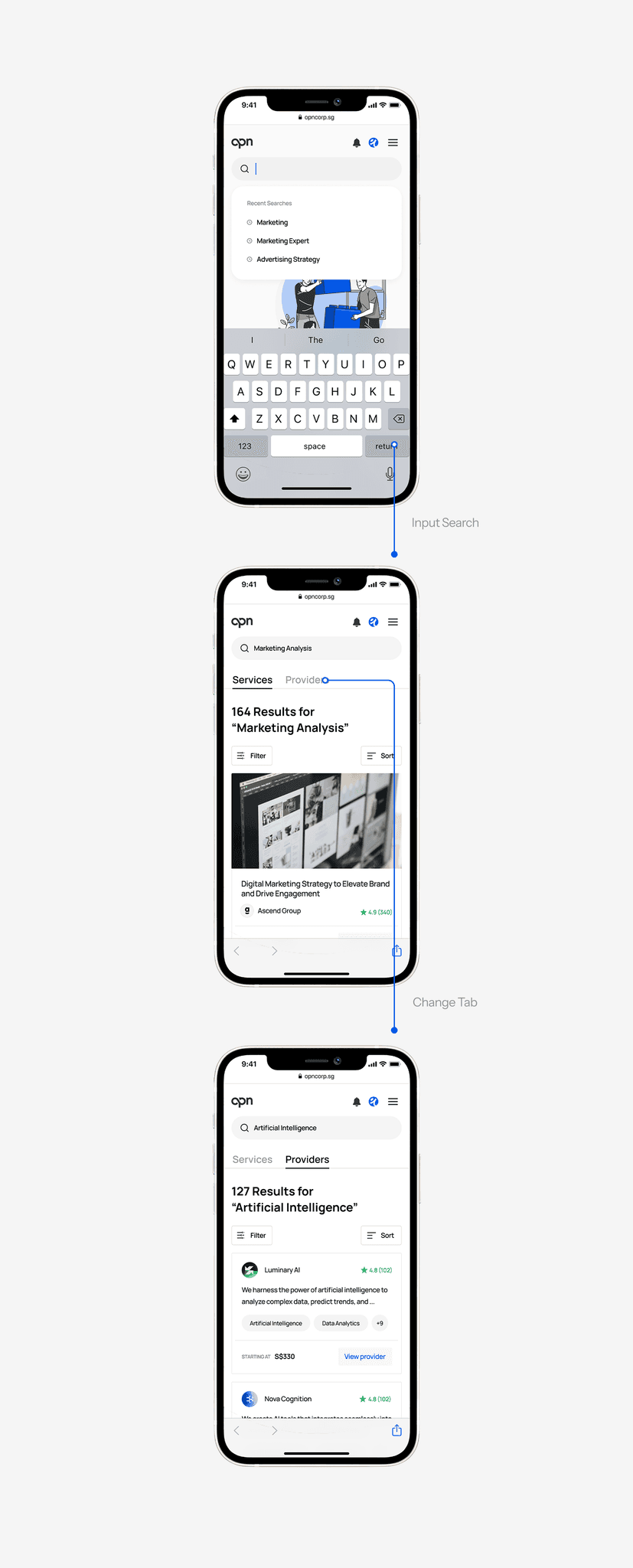
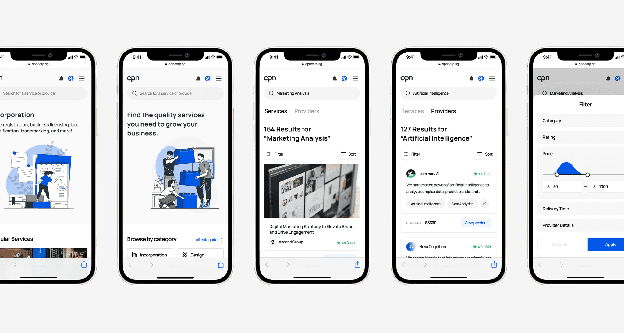
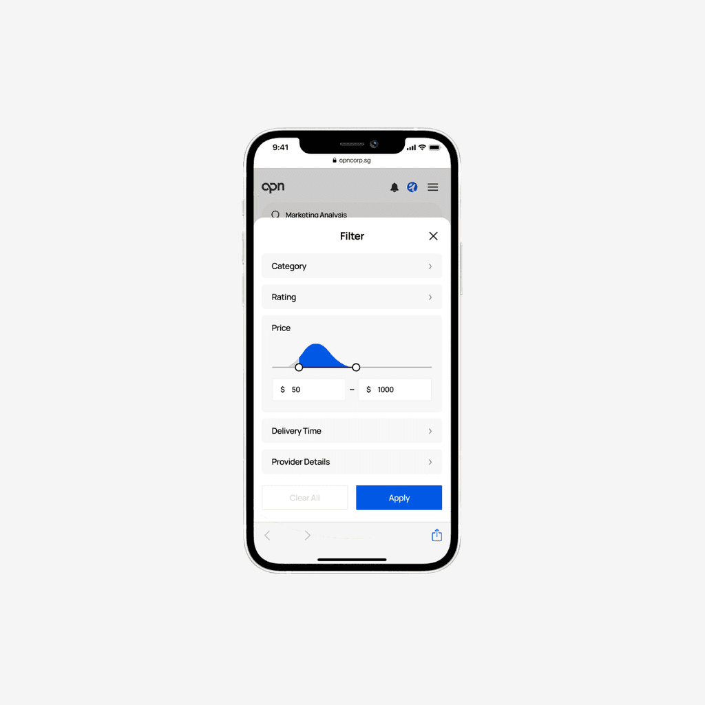
An intuitive buyer experience
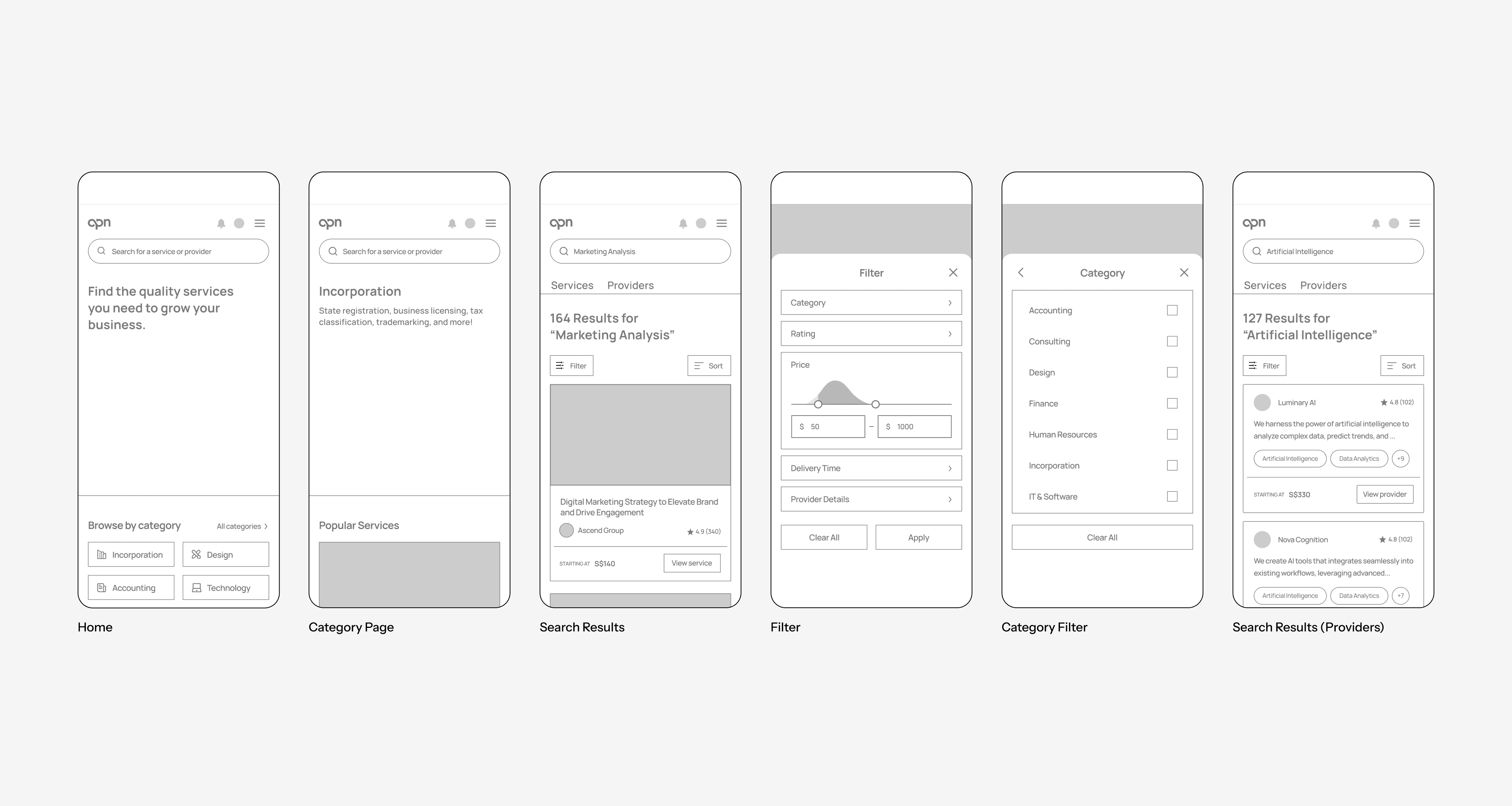
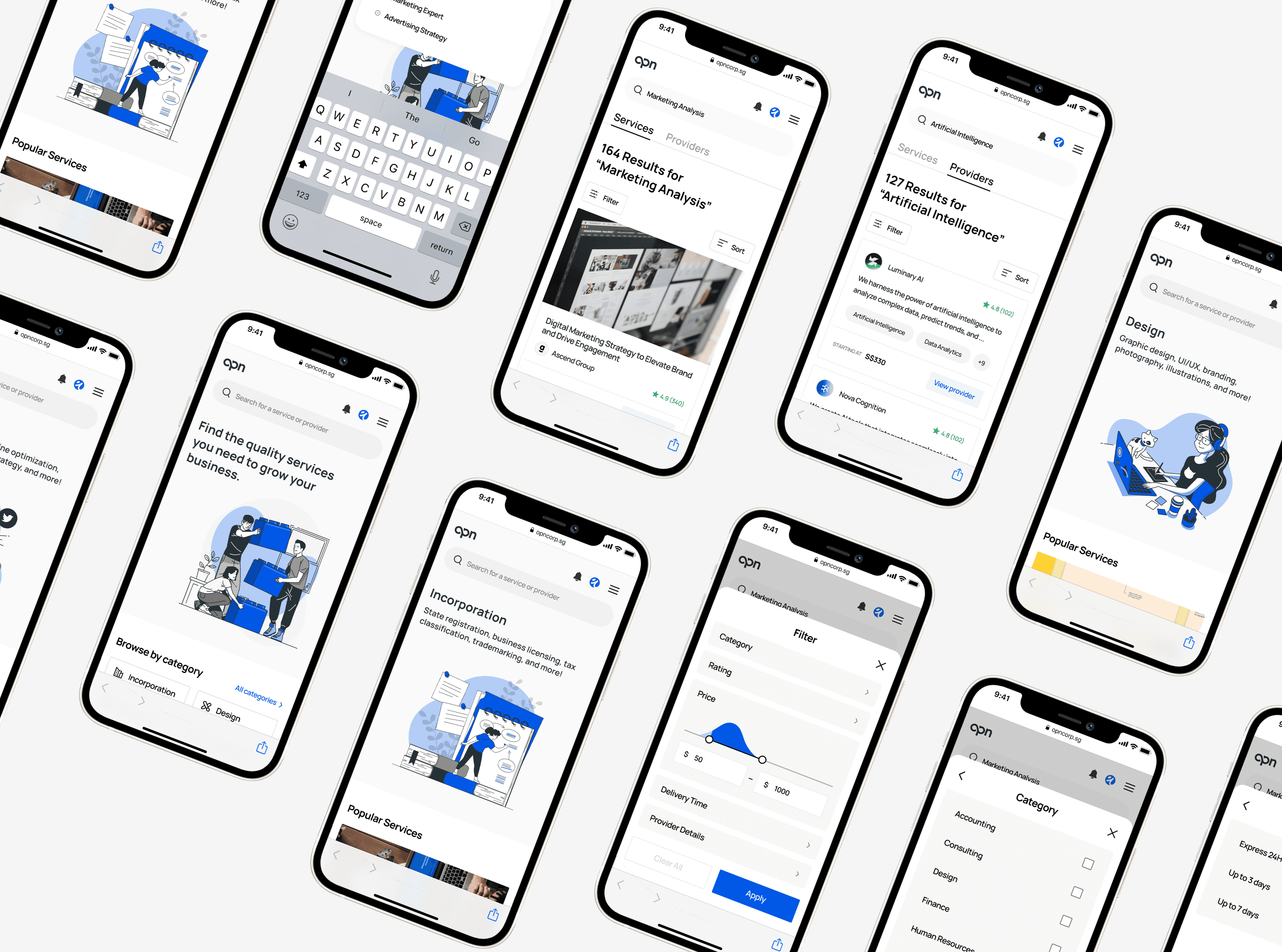
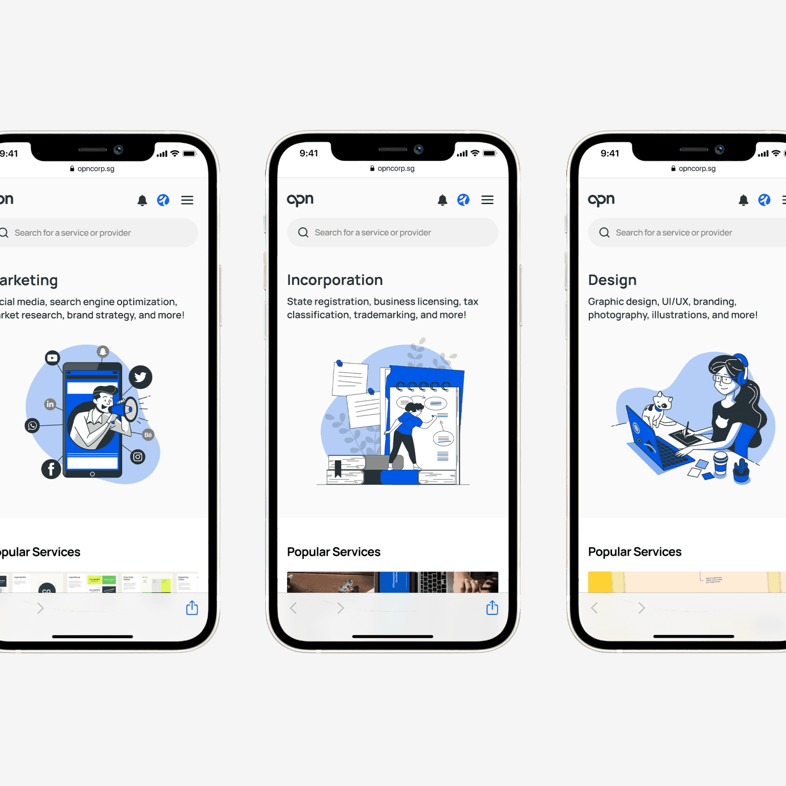
We designed the key user flows to improve the buyer experience. We mainly focused on enhancing service discoverability by improving the choice architecture.
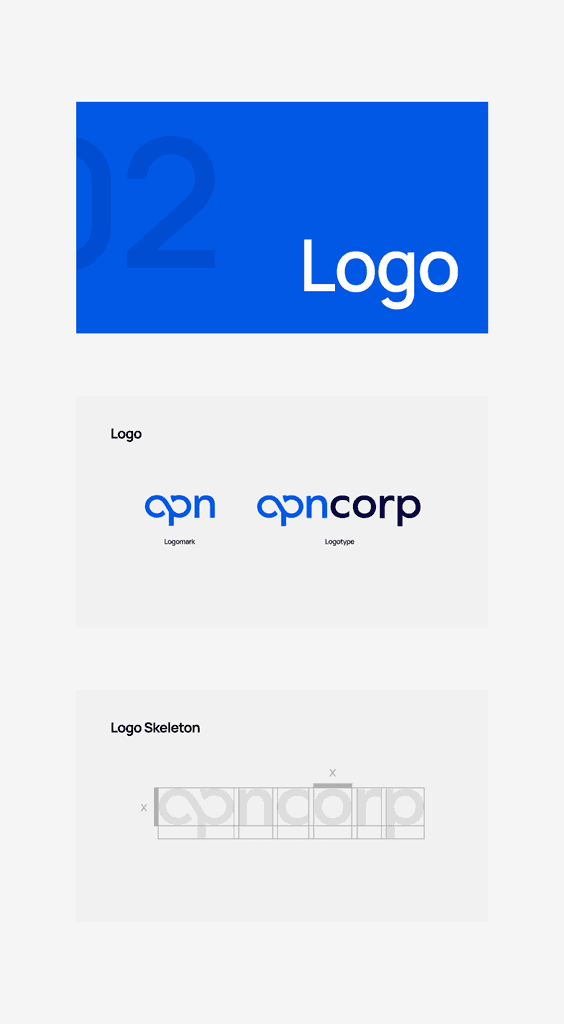
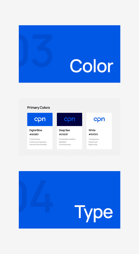
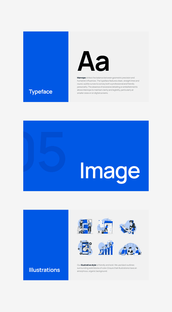
Visual Identity
Capturing the essence of the brand
I was responsible for designing the OpnCorp logo, ensuring it is clean, balanced, and recognizable. I hand picked the typography, colors, and illustrations.
Define
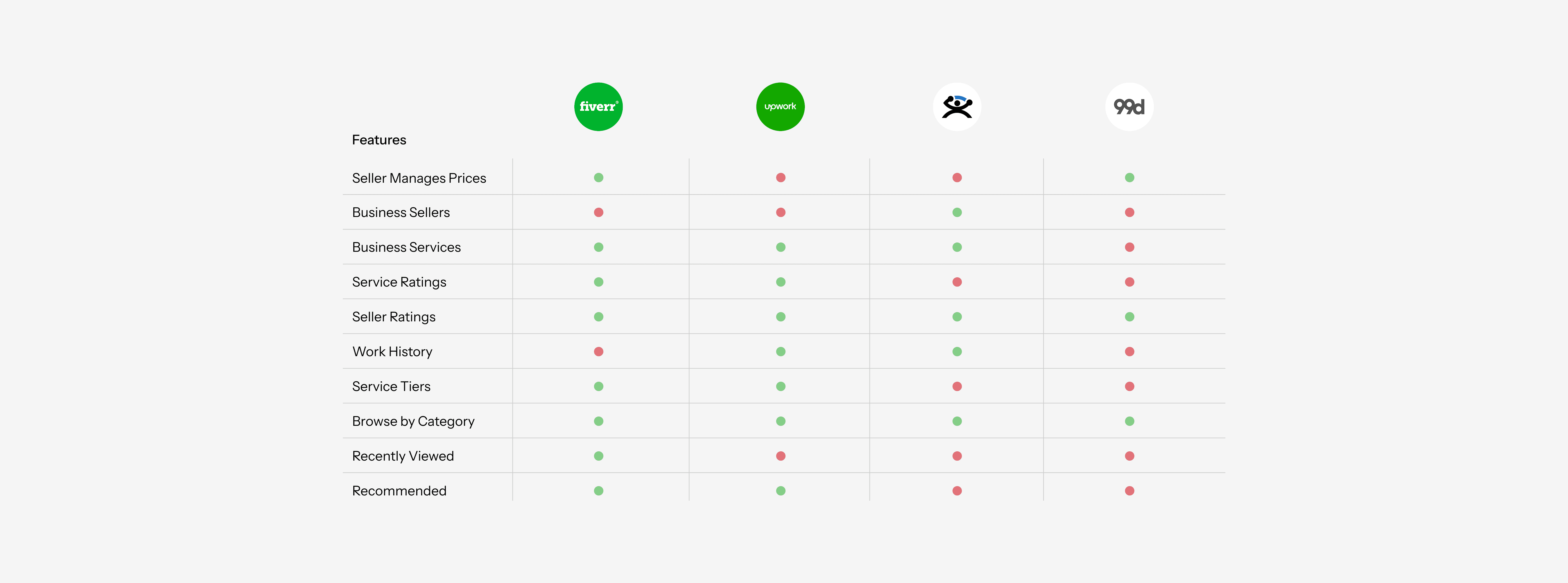
Stakeholders are struggling to discover and connect with the exact service and provider they desire
Buyers often face significant frustration due to the fragmented and inefficient process of discovering, evaluating, and selecting the right service provider. With limited transparency, inconsistent information, and a lack of centralized options, the journey to purchase becomes time-consuming and error-prone, often leading to delays, subpar choices, or abandoned decisions altogether.
Design Question
Personas
I identified two unique personas
I analyzed the needs, preferences, and expectations to better understand user goals to guide the design of new discovery channels.

CEO and Founder of an SaaS startup in Singapore
Goals
Wants a shortcut to vetted, startup-friendly vendors without spending weeks on research.
Seeks a sweet spot between affordable rates and professional output, avoiding both cheap-and-risky and overpriced agencies.
Prefers partners who understand MVPs, lean teams, fast iterations, and ambiguous roadmaps.
Hopes to assemble a go-to list of freelancers/agencies he can rely on for future sprints or projects.
Challenges
Faces a flood of freelancers and agencies online, with no clear way to evaluate who’s reliable or the right fit.
Doesn’t have the bandwidth to vet multiple vendors, check references, or compare proposals in depth.
Many vendors don’t show upfront pricing or bundle in hidden fees, making it hard to estimate true cost.
Burned in the past by flaky freelancers or agencies that overpromised and underdelivered.
Portfolios look good on the surface, but it’s difficult to tell who can actually execute on startup-level needs (fast, lean, and adaptable).
Tools


Director of Operations of a Fortune 500 Company in Kuala Lumpur
Goals
Wants to streamline discovery of vendors who meet compliance, scalability, and SLA expectations.
Looks for partners who understand her team’s goals, tech stack, and operational context.
Wants transparent proposals with references, security credentials, and compliance documentation upfront.
Seeks to expand vendor options without adding unnecessary complexity or management overhead.
Challenges
Faced with too many vendor options across platforms with little differentiation, making shortlisting difficult.
Difficult to identify vendors that align with both GlobalTech’s enterprise standards and local/regional business nuances.
Often depends on word-of-mouth or personal connections, which limits the discovery of new or niche providers.
Frustrated by generalist agencies that claim to “do everything” but lack proven depth in key areas
Struggles to validate vendor claims on expertise, case studies, and references, especially across borders.
Tools